Tutorial - How to Analyse Golf Stats and Golf Scores
|
Golf Stats and Golf Scores Analysis to Maximise your Ability
Probably one of the best ways to help you discover how
ChartMyGolf
can help you improve your game is to jump right in and give you a tutorial
using a fictitious golfer.
|
Note: Golfers who typically only play on 9 hole courses should click this link for
a brief summary for 9 hole courses.
Download the tutorial golfer.
(PC users can right-click the link and Save-As.) Then load the software by clicking the
[Stats]
link at the top of the page next to the [Home] link.
Silverlight
This is one of the advantages about ChartMyGolf being
built on the powerful Silverlight web-technologies.
Instead of your golf stats being saved onto a server and potentially being overwritten every time you want to
revisit the tutorial for some tips, you can load and save as many times and with as many sets of golf stats
as you want. You can even make dated-saves of your own golf stats for added protection.
The sections we are going to focus on in this tutorial are:
- Loading the Tutorial Golfer,
- Getting to the Graphs Dialog Box,
- A Round Summary - A Golf Stats Summary,
- A Golf Round in Graphical Form
- Personal Stroke Index,
- Personal Stroke Index verses Stroke Index,
- The Score Combo Box,
- The Section Combo Box,
- The Type Combo Box,
- The Style Combo Box,
- Multiple Courses/Tees,
- Multiple Golfers and
- Have Fun.
Loading the Tutorial Golfer into ChartMyGolf

|
Once you have downloaded the
tutorial golfer
and saved it to your hard-drive you can load it into
ChartMyGolf
by clicking the icon shown on the left.
The Load File dialog box will appear. Locate the
tutorial.glf file on your hard-drive and then click Open.
You will get a confirmation message instructing you the data has been loaded.
|
Getting to the Graphs Dialog Box

|
When in the main menu of ChartMyGolf you can navigate
to the Graphs and Charts dialog box by clicking on the icon to the
left.
|
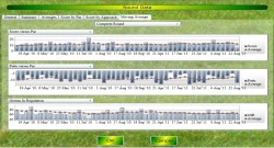
A Round Summary - A Golf Stats Summary
Let's start simply. We will get a summary table of a single round of golf.
This is the same summary you get when you first submit the round or view a round on the
Round Table.
Click the white-space in the Golfer combo box at the top of the screen.
A drop-down list will appear showing all the golfers that have been loaded into the program.
In this tutorial, it is only one, so just click on that one.
When you move your mouse outside of the drop-down list it will disappear.
Click the white-space in the Course combo box.
A drop-down list will appear showing all the courses.
Click on Green Valley: White.
When you move your mouse outside of the drop-down list it will disappear.
Since we only want to view a single round, and since by default all the rounds will be
selected at this time, we will clear all the selections.
Click the None button on the right of the
Round combo box.
The Round combo box will be showing No Rounds.
Click the white-space of the Round combo box and select the round
played on the
22nd Aug 2011.
When you move your mouse outside of the drop-down list it will disappear.
Note: As a point of interest note that the from and to dates have automatically set themselves to the
22nd Aug 2011.
You can select multiple rounds when chosing a round summary and the most recent of those rounds
will be the the focus of analysis.
This is done to allow a quick change between Round Summaries and other graphs.
|
Set up the combo boxes with the following entries.
(The program's AI will auto-fill lower entries as other options become greyed and unavailable due
to your earlier selections.)
- Focus: Round Summary
- Score: General
- Section: General
- Type: General
- Style: General
Click the Draw button and a summary table with information of your
round will be displayed.
|
Analysis: A quick look at the statistics shows most holes were either
par, par+1 or par+2 (purple, yellow or orange) with just one birdie.
Fairways hit were reasonable but could do with improvement. Greens in Regulation (GIR) were consistent
in line with the Fairways Hit.
However, look at GIR+1. Hover your mouse over the label and it explains what GIR+1 is.
Instead of the need to get to the green in 2 less than par, a GIR+1 is where you only have to get
to the green in 1 less than par, ie you are given an extra shot to get to the green.
This is a useful statistic for bogie golfers (those around a handicap of about 18).
Bogie golfer lose, on average, about 1 shot per hole. So GIR+1 is a good indication of whether that
shot is being lost getting to the green.
Further analysis shows Sand Saves were reasonable for the full nine but the Up and Downs (sometimes
known as scrambles) were very poor. The golfer is better at greensdie bunker play than off green
chipping putting. This would be area for additional practice.
Now click on some of the tabs at the top of this page. Clicking the General tab shows the information
you submitted when you entered this round. It is uneditable and so is safe.
|
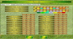
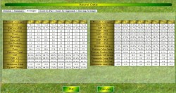
Now click on the Averages tab. A table is presented showing the averages for this (1) round,
averages for the chosen round and the previous round (2), averages for the last 3, 5, 10, 20, 30 and
50 rounds. Once again if you hover your mouse over any of the labels you will find a brief explination
of its meaning.
|
You can see the golfer's score has inmproved over the most recent rounds falling from an average of
about 12. Also another key statistic is the greenside total which sums all the shot on and around the green.
Ideally this will be 2 shots per hole and it is presented on this table as a difference from this ideal.
This had been running at typically +5 but has reduced recently to the present -1.
Up and Downs (scrambles) are consistenly poor, however the usual poor sand save total has risen to a
respectable 60%.
The right hand side of the table shows some of the more obscure statistics. Once again do not forget
to hover the mouse over the label to get a brief explination.
Let's look at a few. GIR/FH is the greens in regulation when a fairway hit is achieved.
If you compare this with the standard Fairway Hit this is typically 15-20% higher.
This is a significant and telling improvement showing that a wayward teeshot is having a very major
effect on the golfer's ability to get to the green in the expected number of shots.
Additionally the GIR/FM, greens in regulation per fairway miss, is very low confirming the
previous statistic.
From these two stats the golfer can realise that being a little more conservative with their tees hot
on dangerous holes could be a good playing strategy.
Another good set of statistics are the greenside totals when compared to the approach shot.
Again this is compared to the ideal 2 shots per hole around the green.
You can see the significant negative effect an off green approach shot is having on the golfer's score.
|
|
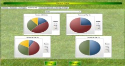
Now click the Score by Par tab. You will see the distribution of scores compared to par represented
in pie charts. You can even change this to view differnt aspects of your game.
In the combo box at the top of the page, change this from Score to Fairways Hit. Note, the Fairways Hit
pie chart for Par 3 holes is missing. This is due to Fairways Hit not being recorded for par 3 holes.
|
|
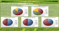
In addition to comparing your statistics based on par you can also compare by the approach shot.
Click on the tab Score By Approach Shot. Again, every aspect of your game can be analysed in this way.
|
|
Finally click on the tab labeled Moving Average.
You can simultaneously compare three aspects of your game, including their moving averages.
A moving average is just like a normal average but older data is reduced in significance making
the newer data more important. Do not worry about the math, that is done all behind the scenes.
Just think of it as a normal average.
|
You can hover your mouse over any bar (or any node in the case of the moving average line) to get the
exact value of that data point.
Click the title combo box above each graph to change the focus of that graph. Additionally click the
combo box at the top of the page to change the section of the course being highlighted, from
the Complete Round to either the First or Last Nine.
Note: The previous rounds shown come from the most recent ones played at any
course so all scores are compared with par when necessary.
Note: More will be added to this round summary sheet, hopefully in the near future.
A Round in Graphical Form
Using the same golfer, course and round as in the
Round Summary
above, this time we will present this round as a graph.
|
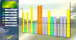
Set up the combo boxes with the following and then click the Draw button.
- Focus: Gross Score
- Score: Score
- Section: All Holes
- Type: Standard
- Style: Bar Chart
|
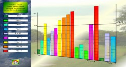
A bar chart of the round will be shown.
The graph's axes are labelled at the extremes; top and bottom, left and right.
If you pass your mouse pointer over the graph you can enable additional labelling for pinpoint
accuracy.
Note: Each hole on the graph is coloured according to whether the golfer scored birdie, par, par+1 etc.

|
Click the icon on the left to get back to the Graphs
dialog box then change the selection in
the Focus combo box to Score verses Par.
Click Draw again.
|
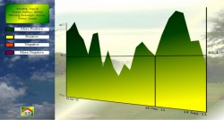
|
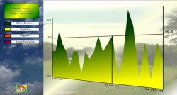
This time the round will be shown but with each hole's score adjusted by par.
The graphs will be coloured according to the par of the hole.
This graph clearly shows the golfer was doing better on the last few holes as most
holes appear on or below the x-axis, ie par or below par.
The golfer scored birdie (1 under par) on holes 2, 6 and 13.
|
Personal Stroke Index
|
Again return to the Graphs dialog box and set up with the following
and then click Draw.
- Focus: Personal Stroke Index
- Score: Score
- Section: All Holes
- Type: Standard
- Style: Bar Chart
|
This graph ranks the holes into order of difficulty, the hole ranked 1 being the most
difficult and 18 being the hole you find the easiest.
You can see, since the Personal Stroke Index is only being calculated using the golf stats
from this single round,
that holes 2, 6 and 13, the holes on which the golfer scored under par, are ranked the
easiest holes, with hole 2 being ranked the easiest.

|
Quickly return to the Graphs dialog box again and click the
All button on the right of the
Rounds combo box and then click the
Draw button again.
Now the golfer's Personal Stroke Index is calculated for all the rounds he has played on the
white tees of Green Valley.
Notice that hole 2 is no longer ranked the easiest.
|
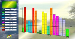
Personal Stroke Index verses Stroke Index
Return to the Graphs dialog box, click the white space in the
Rounds combo box and select just
the round played on the 22nd Aug 2011.
|
Set up the combo boxes with the following and click Draw.
- Focus: Personal Stroke Index verses Stroke Index
- Score: Score
- Section: All Holes
- Type: Standard
- Style: Bar Chart
|
A new graph appears but comparing your personal success for the selected round
compared to the official Stroke Index.
The holes are ranked 1 to 18 again but this time the hole with the comparative index of 18 is the
officially hardest hole you are playing the best.
Contrary to this, the hole with comparative index of 1 is the officially easiest hole you are playing
the worst.
So on this graph we can see the golfer is playing hole 15 the best when compared to the official
stroke-index and is playing hole 16 worst when compared to the official stroke-index.
So how can this help you in your game? In a competition you will know on which holes, according to the
official Stroke Index, you should be gaining strokes and those holes on which you need to avoid
losing strokes.
If you are playing aggressively and wanting to play better than
is typical
you need to play normally
on your easiest holes (holes with comparative stroke index 10-18) and play better than normal on
your most difficult holes (holes with comparative stroke index 1-9).
Alternatively, if you are playing conservatively and wanting to play at your
typical level
you might consider playing at your standard level on the most difficult holes
(holes with comparative stroke index 1-9)
and try and either stay at your standard level or better on your easiest holes
(holes with comparative stroke index 10-18).
The Golf Score Combo Box
We have now looked at the many different aspects of the Focus combo box.
Now we will look at the Score combo box.
If you click it you can see the many aspects of you game that can be analysed.
Up to now we have just been focusing on the round's score but as you can see every piece of data
you submit when entering a round can be the focus of the graph as well, including many more
derived from the data you entered.
Note: The General element of the combo box is used when a
Round Summary is chosen in the
Focus combo box.
Select All Rounds.
Let's just pick element from the Score combo box; Putts.
Set up the combo boxes with the following and click Draw.
|
Select All Rounds. The combo box settings for the putts are:
- Focus: Gross Score
- Score: Putts
- Section: Total
- Type: Standard
- Style: Line Chart
|
You will see the gross number of putts you scored on each round.
To ensure the active area of the graph is presented as large as possible, the AI in the graph drawing
functions start the y-axis labelling around 23 in this case.
The AI will alter this on a case by case basis.
When determining par for a hole you are given two strokes which can be used for putts.
Consequently, for an entire round you are given 36 strokes for putts.
So return to the Graphs dialog box and click on
Score verses Par in the
Focus combo box.
|
Select All Rounds. The putts verses par set-up.
- Focus: Score Verses Par
- Score: Putts
- Section: Total
- Type: Standard
- Style: Line Chart
|
Now your putts per round are presented compared with the expected 36 per round.
You can see that the golfer managed to score less than 36 putts on all occasions for this course.
Return to the Graphs dialog box and click
Fairways Hit in the
Score combo box and then click the Draw button.

|
Select All Rounds. The Fairways Hit set-up.
- Focus: Score
- Score: Fairways Hit
- Section: Total
- Type: Standard
- Style: Line Chart
|
The percentage number of times the fairways were hit with your tee shot are presented.
A good percentage is near 100% saying you are hitting the fairway with your tee shot with a
good regularity.
A bad percentage is near 0% saying you are not hitting the fairway at all with your tee shot.
Note: you will see no change if you change between Score and Score verses Par
in the Focus dialog box when the
Score combo box is set on Fairways Hit.
This is the same for all percentage based score, eg Greens in Regulation.
Try some of the other score types. Click between the Score and Score verses par.
You will see Putts and Greenside both consider par as 2 per hole as you are expected to hole-out
within 2 when around the green.
The Section Combo Box
Return to the Graphs dialog box,
select All rounds and set up the combos as follows
and click Draw.
- All rounds selected.
- Focus: Gross Score
- Score: Score
- Section: Front Nine
- Type: Standard
- Style: Line Chart
|
You can see you can separate out the scores front and back nines.
Again you can go back to the Graphs dialog box and click
Score verses Par.
This is a good way of analysing your game on 9-hole courses.
|
Return to the Graphs dialog box and click
All Holes in the
Section combo box.
Click the Draw button.
- All rounds selected.
- Focus: Gross Score
- Score: Score
- Section: All Holes
- Type: Standard
- Style: Line Chart
|
A very strange, spiky graph will appear.
Every single hole played, in order, is represented individually.
If you scroll the mouse inside the graph area and look at the bottom axis you will see
that each hole is labelled.
For the number of rounds represented in this graph it becomes a little hectic.
However this graph is an excellent way of getting a lot of stats for just a few rounds.
|
Go back to the Graphs dialog box and click the single round of the
22nd Aug 2011
in the Round combo box and click Draw again.
|
- Round Selected: 22nd Aug 2011
- Focus: Gross Score
- Score: Score
- Section: All Holes
- Type: Standard
- Style: Line Chart
|
Each hole of that single round is now labelled showing your progress during its play.
This is good but since we are looking at the score of each hole and each hole has a different
par, go back to the Graphs dialog box and click
Score verses Par in the
Focus combo box.
Click Draw again.
This graph is much more meaningful as you can see if the golfer's round was improving compared to par.
So we have looked at the total score for each round, each nine and all the holes in order.
In addition to that you can look at each hole individually over time.
Go back to the Graphs dialog box and click the
All button next to the
Rounds combo box.
Click Gross Score in the Focus combo box.
Click Hole 1 in the Section combo box and click
Draw.
- All rounds selected.
- Focus: Gross Score
- Score: Score
- Section: Hole 1
- Type: Standard
- Style: Line Chart
|
All the scores achieved on Hole 1 of the White tees of Green Valley are shown in order.
Again, if you would like to see this compared against par go back to the
Graphs dialog box and
click Score verses Par in the
Focus dialog box. Click Draw again.
The most up to date scores, those on the right, are predominantly green (positive) while earlier
you had a short period of red (negative) scores.
|
The Type Combo Box
Up to now we have been drawing graphs using a standard method where each score was literally plotted
on the graph.
However, due to the very nature of the game of golf it is very difficult to recognise whether you
are improving or not in the various aspects of your game.
Quite often you could be oscillating around the same score, overall or even on each hole.
How could you determine if progress was being achieved with scores like 4, 4, 3, 5, 4, 4?
Obviously an average springs to mind as a solution but surely scores you have achieved many
rounds ago should not unduly influence this average.
Even the most recent round should carry more weight than the last round but one.
Thankfully there are mathematical methods that can make sense of oscillating or rapidly changing and
erratic information, while making sure older data, while still incorporated in the result, does not have
an overbearing influence over the most recent information.
The good news is, while this can be a little complicated and subtle, it is all done under-the-hood
and given to you in a very easy to read format.
All you need to do is concentrate on the results and how to read them.
Go back to the Graphs dialog box and set it up with the following and
click the Draw button.
- All rounds selected.
- Focus: Gross Score
- Score: Score
- Section: Total
- Type: Standard
- Style: Line Chart
|
We have met this graph before showing your total scores over time.
Its not the easiest graph to analyse. The golfer had some good low scores in the middle but seems
to be getting worse again. Is this right?
|
Return to the Graphs dialog box and set up as follows.
|
- All rounds selected.
- Focus: Gross Score
- Score: Score
- Section: Total
- Type: Moving Average
- Style: Line Chart
|
Now it is becoming more clear. This graph is a very special average graph.
You can think of it exactly as an average graph, although behind the scenes it is doing some very
clever mathematics making sure old scores do not influence the most modern data too much while still
not completely ignoring them.
Since it is an average and we are looking at scores, a high score is bad while a low score is good.
If on the other hand we were looking at fairways hit, a high percentage would be good and
a low percentage would be bad.
Now we can see our score-average was generally going up but has started to reduce again.
Those middle scores did reduce it slightly but could not adjust it significantly enough to stop the
overall trend upwards (although it does seem to be getting a bit better at the end).
Can we make this even more explicit? Yes we can. Return to the
Graphs dialog box and click Progress
in the Type combo box. A new graph is drawn. A Progress Graph.
A Progress Graph always has positive (green) values as good and negative (red) values as bad
irrespective of whether you are looking at the score or fairways hit, which have different
interpretations on high and low values.
The y-axis does not have any labels as they do not have any other meaning except whether they are
positive or negative.
|
- All rounds selected.
- Focus: Gross Score
- Score: Score
- Section: Total
- Type: Progress
- Style: Line Chart
|
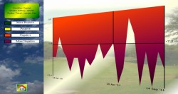
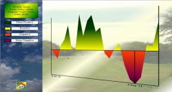
We can see on this graph we were getting worse in the early stages (the negative red section)
but in the middle managed to briefly edge in the green.
That means in those sections, if we could have maintained that progress we would have been getting better.
However, we quickly went back into the red (bad).
The good news is this started to reverse and is once more back into the green (good) side of the graph.
So as of the most recent date on this graph, 14th September 2011, the golfer is improving once more.
Notice also this graph can act in some way as a predictive measure.
Prior to the 6th September the graph was rapidly increasing, indicating the golfer was undergoing some
major improvement. This was predicting the golfer was heading back towards the green is good section
before the improvement was actually confirmed.
Return to the Graphs dialog box and click on
Fairways Hit in the
Score combo box and click Standard
in the Type combo box and then click the Draw button.
Yet again we see a reasonably erratic graph.
Is the golfer making progress or not?
- All rounds selected.
- Focus: Gross Score
- Score: Fairways Hit
- Section: Total
-
- Style: Line Chart
|
Return to the Graphs dialog box again and click
Moving Average in the
Type dialog box and press Draw.
Since this is a graph showing the average for Fairways Hit a high score near 100% is considered good
while a low score near 0% is considered bad.
If you look at the y-axis labels you can see we are over 50% which is average but are we improving?
In the middle to late sections there is a block of green we expect that must be an improving area.
Let's see.
|
- All rounds selected.
- Focus: Gross Score
- Score: Score
- Section: Total
-
- Style: Line Chart
|
Return to the Graphs dialog box and click Progress
in the
Type combo box and click Draw.
Do not forget, on the Progress graph green is always good and red is bad, irrespective of what
statistic is being analysed.
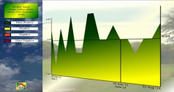
So yes, that early section was an area of consistent improvement.
However, then we reached a plateau on the standard chart and this is reflected in the
progress chart falling back to 0 and oscilating around the axis.
The two graphs togather are telling us the golfer made some major improvements to get to
a high level but now he has stagnated around this consistantly high level.
|
The Style Combo Box
So far in this tutorial we have predominantly looked at line charts.
However, as we saw when looking a single round, there are also bar-charts.
In addition there are histograms and pie-charts.
Return to the Graphs dialog box and set it up with the following
then click the Draw button.
- All rounds selected.
- Focus: Gross Score
- Score: Score
- Section: Total
- Type: Standard
- Style: Line Chart
|
We have met this line chart before but how else can we view this information?
Quickly return to the Graphs dialog box and
click Histogram in the Style combo box and
then click the Draw button.
|
|
- All rounds selected.
- Focus: Gross Score
- Score: Score
- Section: Total
- Type: Standard
- Style: Histogram
|
A graph similar to the line chart appears but with each round singled out as a column.
This graph might be more useful than the line chart when there are a reasonably low number of rounds.
Obviously when the number of rounds increases you will likely prefer the line chart.
Return to the Graphs dialog box and
click Bar Chart in the Style combo box and
then click the Draw button.

|
- All rounds selected.
- Focus: Gross Score
- Score: Score
- Section: Total
- Type: Standard
- Style: Bar Chart
|
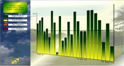
All the rounds played are now represented in bar form, coloured according to score groupings.
In some cases this colour-coding will be more useful than both the line and histogram charts.
Return to the Graphs dialog box once more and
click Pie Chart in the Style combo box and
then click the Draw button.
|
- All rounds selected.
- Focus: Gross Score
- Score: Score
- Section: Total
- Type: Standard
- Style: Pie Chart
|
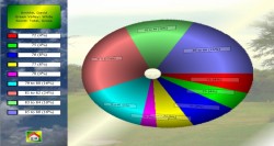
This time the golf stats is presented in a pir chart, with my AI grouping the scores with a bias towards
best scores being represented in as small a group as possible.
Multi Courses/Tees
So far we have been focusing on just a single set of tees on a single course.
However, we have extended the program to allow cross course analysis as well.
Return to the Graphs dialog box and set it up with the following.
- All rounds selected.
- Focus: Gross Score
- Score: Score
- Section: Total
- Type: Standard
- Style: Line Chart
|
Do not Draw click yet.
Instead hover your mouse over the
All next to the Course(s) combo box
but look at the Focus combo box.
Still looking at the Focus combo box click the
All button you are hovering over.
Notice how the program's AI automatically changes the Focus combo box
entry to Score verses Par.
|
It does this since gross scores on different courses stop having meaning as one course can have
a different par than another. It is like comparing apples with oranges.
The AI spots this and automatically changes the setting for you.
Click the Draw button and the line graph will appear.
Keep on returning to the Graphs dialog box and
click the Pie, Bar and Histogram Charts.
Note: both Stroke Index options in the Focus combo box will
automatically be greyed (unavailable) as well as Gross Score since they are
single course specific as well.
Multiple Golfers
Even though this tutorial has a single golfer loaded into it, the program will accept multiple golfers
and will also analyse this data in the graphs and chart section.
Obviously some data will be greyed (unavailable) since some data is specific to a single
golfer.
Have Fun with your Golf Stats
Those are the graph types. Why not experiment yourself. Perhaps you want to look at a single hole
in a pie chart, maybe a bar chart.
Do not be afraid of the Graphs dialog box, if you can think of a graph
type just jump in and try it to see if it works.
It took a lot of work to make it easily accessible and still leave this part of the program as
open as possible.....and the great thing is we intend to add a lot more to it as well.
For a
golf stat glossary
you can link here.
Some ideas on how to
keep your golf stats
on the course can be found here.
To see some of the leading
golf pros golf stats
go to this link and find the Season Statistics.
Return to the main [Help] menu.